






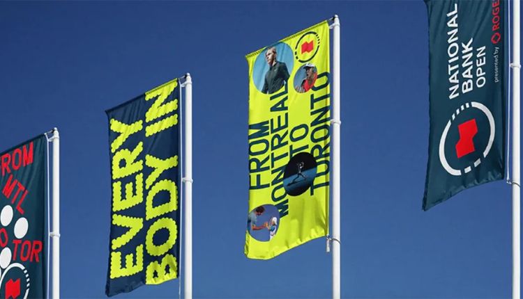
Designing for distance means treating your banner like a visual signal meant to be read quickly, from far away, often under glare, wind, rain, and variable viewing angles. Start by defining the typical viewing distance and the expected placement, such as on a fence, next to a road, or on the face of a building. Then translate that distance into readable typography, high-contrast color pairings, and a layout that preserves clarity even when the fabric stretches slightly or the banner ripples. You will get the best results when you design for speed of recognition, so a passerby can identify your message in a glance, rather than requiring close inspection.
Material Selection For Outdoor Durability And Consistency
Choose an outdoor-rated substrate that resists tearing, fading, and water absorption. Vinyl is a common choice because it holds color well, tolerates cleaning, and supports sharp ink laydown. If you are coordinating production with custom vinyl banner printers, confirm that they support outdoor inks, durable lamination or coating options, and consistent color profiles across runs. You should also request a technical spec sheet that covers thickness, weight, and recommended temperature ranges, because those details affect how the banner behaves in sunlight and wind. For added performance, select reinforced hem styles and corner reinforcement, since those areas experience the highest stress during installation.
Typography And Layout Specifications For Readability
Your typography should be sized according to viewing distance, with headline text large enough to remain legible through perspective and motion blur. Use simple, high-contrast fonts, such as bold sans serif styles, and avoid overly decorative lettering. Keep key information in a single visual plane, with generous spacing so letters do not merge when the banner is viewed at an angle. Use a limited palette, typically two dominant colors plus a neutral, and ensure the background and text colors have strong contrast. If you include small supporting text, treat it as secondary, because distant viewers will prioritize your main call to action.
Color, Ink, And Contrast Performance Requirements
Outdoor graphics depend on how ink behaves under UV exposure and moisture. Specify fade-resistance expectations and choose color settings that avoid overly light grays that can wash out in daylight. You should require proofing or calibrated previews, so you can confirm that brand colors match the intended output. Consider adding a white or light base under dark elements when needed, since it improves legibility and reduces show-through. If the banner will sit near reflective surfaces, adjust contrast so your message remains clear under highlights and shadows.
Finishing, Reinforcement, And Mounting Interfaces
Banners are pulled taut during installation, so finishing choices determine how the design stays flat and how edges resist tearing. Specify the type of hems, grommets, or pole pockets, and confirm spacing that matches your mounting hardware and wind conditions. Reinforced corners reduce edge stress, and a consistent seam strategy helps prevent localized distortion. You should also account for how your banner will be tensioned, because excessive sag can reduce readability and change the effective angle of your text.
Sizing, File Setup, And Production Tolerances
Provide final dimensions in inches or millimeters, include bleed and safe zones, and specify that critical text stays within a guaranteed safe area. Use vector artwork for logos and lettering whenever possible, and ensure images are high resolution enough to avoid pixelation. Ask about production tolerances, such as how the printer handles stretch, stretching limits, and how color profiles affect fine gradients. If you need consistent registration across multiple banners, request confirmation that the production workflow maintains alignment across runs.
Installation Planning For Real World Viewing
Plan for lighting, viewing angle, and environmental forces before production is finalized. If the banner will rotate slightly in the wind, avoid placing the main text too close to the edges, as distortion becomes more noticeable away from the center. For locations with direct sun, design to prevent glare, and consider matte finishing options where reflections could obscure ink. Verify clearance around the banner so it is not partially blocked, and confirm that your mounting method maintains consistent tension across the full surface. For layout decisions, test a scaled mockup against your expected distance and angle, because the real-world perspective is what determines impact.
Additional Resources For Technical Guidance
Review industry guidance and handling recommendations from organizations that publish printing standards and material testing methods, such as the standards and education sections of ISO-related materials, and consult durable graphics resources from organizations like signage and print associations. You can also look at material safety and environmental considerations from reputable sources such as the U.S. Environmental Protection Agency, focusing on general best practices for outdoor media handling and care. For installation and maintenance tips, check documentation from professional signage and banner installation communities, focusing on tensile handling and edge protection, such as guidance from the Signage Industry Association, focusing on practical durability and installation considerations. The more you know, the more effective your signage will be.